Dinosorceror wrote:
Hrm...if I 'twer to offer kree-teeque on this one, I've got problems with stuff you didn't mention, and no problems with what you did.

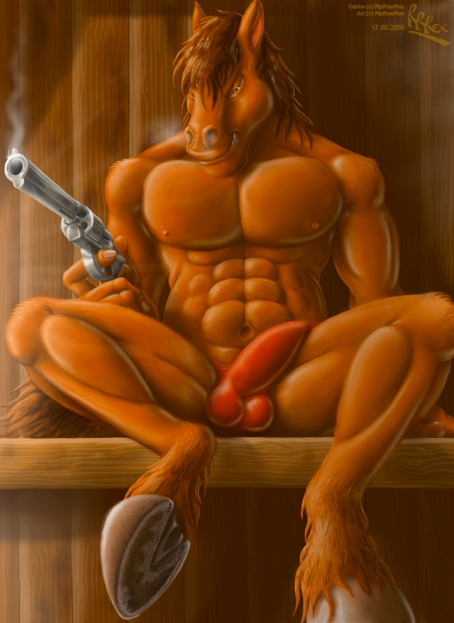
I think the background, hoof and gun are fine, except maybe that he doesn't jump out from the background enough, but I have problems with his fingers and head. His fingers seem way too long, kinda...creepy-spindly.
And maybe I'm not much for horse muzz'l, and I know he apparently is pressing chin to chest, but his head is just kinda...funky overall. Meh, but the more I look at it, the more it doesn't seem to matter, though. Fingers still look spindly, though.
Yay! I actually gave real criticism for once!
 *ooof* And that's what I get...
Your point on the fingers was actually something I mentioned, albeit less explicity:
RipRoarRex wrote:
When I did finally get a gun shape that I was at least content to settle for, it seemed to be completely incompatible with the body and hand that I had already drawn. Correcting this would have required moving and redrawing the hand and that damn gun again, and that in itself would have involved tacking another piece of A4 onto the left-hand side of the picture because I had ran out of room.
The extension of the index finger in particular was largely a result of the gun not matching up with the hand I'd drawn, and a desperate if somewhat lazy attempt to
make it fit, even if it did compromise anatomy. I was just so fed up with drawing that damn gun that I didn't want to mess around with it anymore.
As for the muzzle, I appreciate that the lower jaw is definitely wrong. Too big, and the mouth doesn't really line up with the snout. I'd noticed that fairly early on in the colouring stage, but by that point, it's really damn difficult to fix it, so I left it, thinking it just wouldn't matter. In all honesty, I don't like the left eye (i.e. Carlos' left, as opposed to ours) - I'm still not sure it's positioned correctly, and the pupil never seemed to have the shiny glint that I wanted it to have.
Still, thanks for the pointers anyway, Dino.
Karo Roo wrote:
I like your line work, I like your textures, I like your proportioning. The distinctness of the hoof is very nice, lots of detail there. I don't see anything that it particularly off.
content wise. I love carlos, cause I'm a bit of a hoof slut to add to my pawlove. but I like alot of things about anthro horse characters as well as the quadroped ones. Horses are just neat. win win. nice stuff rex.
I enjoy horses too, even if I find them very difficult to draw. Glad you liked the hoof too - I wanted this one to serve a bit of a dual purpose, seeing as I haven't drawn Carlos' soles before.
DragonsLover wrote:
9 days with reaching the max amount of layers possible?
 DAMN!!!
We can't say that these efforts were for nothing because, look at that! It's brilliant! Everything is wonderful, fully detailed as always, and you managed to do a very sexy hoof as well! It's always so impressive and I respect your patience for doing those masterpieces. You really should deserve an artist award or something.
Great work RRRex!
Oh, and I can understand you about the wood...

Yes... I hope it wasn't too boring. It didn't actually take as long as you might think, but it was still pretty tedious. Thanks anyway, DL.
Blue wrote:
I dont know, its surely a fine craftsmanship and so, but it just fails to appeal to me in any way.
The head and face just doesnt look right, especially the nostrils, the chin, ... the upper part of the muzzle looks way to flat and the lower to hight. The belly seems off, too bumpy-bulgy, I dont know, the strange red rocket in his crotch doesnt ring any bell, and the speck has a good point with the fingers there too.
Nice details and theme, but not one of your best pictures imo.
Well I appreciate your honesty, Blue, and you of course have your own tastes. I must admit however that I'm rather stunned and disappointed by that reaction. I know it's far from perfect, but there's negative aspects you've mentioned that I can't say I agree with. I'm of the opinion that this
is one of my best pictures because there are very few of mine to which I've gone to this level of detail and colouring depth, even if the form isn't 100%.
Could you clarify this comment for me?
Blue wrote:
I dont know, the strange red rocket in his crotch doesnt ring any bell
In what way do you find it wrong?
In any case, you're entitled to your opinion, so thanks for sharing.
Diablo wrote:
Superbly drawn, as always!
BUT IT NEEDS MORE RAPTORS

Yes, Diablo.
Everything needs more raptors. (*whistles and makes the finger-twirling crazy gesture)
Lol!