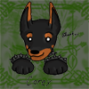
Legacy LD5

Forum/Website Through 2017
About Us 
Member Sites 
Faibanx MUCK
Artist Gallery
It is currently Fri Sep 27, 2024 10:13 pm

All times are UTC - 9 hours [ DST ]


Post new topic Reply to topic  [ 15 posts ] 
Author Message
 Post subject: Carlos & Mike - "Just Stay Professional"
PostPosted: Fri Jun 06, 2008 11:14 am 
Offline
User avatar
The Three 'aws - Paws, Claws and Jaws.
Posts: 413
Location: England
Hi everyone - RipRoarRex returns with another new pic.


Any excuse. Any excuse to draw Carlos' butt. It's quite a severe obsession of mine, really. Bizarrely enough I first thought of this idea a few months back whilst in my brother's car on the way to a football match - not really the most appropriate time or place to be fantasising about soft steamy stallions...(!) It isn't the most original situation but with Mike being his usual awkward and shy self, I couldn't resist draving it. Besides, a lot of my work is very sexually charged with little room for humour, so I thought this might provide a chuckle or two as well.

;)

Anyone who regularly views my work will probably immediately notice something looks a little 'different' about this one. That would be the lack of big chunky black outlines which have been something of a staple of my style ever since I joined the furry scene in April 2007. That's not to suggest that this is the end of my big chunky black outlined work by any means, because I do still like that style on certain pieces. However, I just had to try it with this one, especially because the big outlines that were originally on it were spoiling the sexy hand-to-butt interaction! Lol!

:lol:


Mike's got a new job as a masseur. It's not so bad, but every week he finds himself in an awkward situation with a certain client he has a pretty big crush on. This isn't helped by the fact that Carlos seems to rather enjoy having his buttocks rubbed...


Image

Comments on this new style experiment and the content itself appreciated as ever.

:)


RRRex
_________________
See my latest artwork at my website:

Image

Top
  Profile
 
 Post subject: Re: Carlos & Mike - "Just Stay Professional"
PostPosted: Fri Jun 06, 2008 11:33 am 
Offline
User avatar
Magnificent Bastard
Posts: 544
Location: Wherever there be feetzorz
Do you have a textless version?

I've implied this a couple times before, but now I really need to make it clear. YOU DON'T NEED THE TEXT! The undertones (or are they overtones? heheh...) are plenty easy to pick up on without word and thought bubbles. Their faces say it all.

Also, the lineless effect makes it look more like a real watercolor (perhaps pastel?) painting. Which is not necessarily better or worse than your standard... just awesome in its own right. Score one for the Victorian Era!
_________________
“Frankly, I’ve never thought of folks like you in terms of your species. I see you as part of a larger community.
The community of things that go ‘SQEAK’ when I step on them.” –Bob the Dinosaur
“A Sprotchymon's musings always take a lot of processor power, but are just as always worth it.” -Blue

Top
  Profile
 
 Post subject: Re: Carlos & Mike - "Just Stay Professional"
PostPosted: Fri Jun 06, 2008 11:49 am 
Offline
User avatar
The Three 'aws - Paws, Claws and Jaws.
Posts: 413
Location: England
Sprotchymon wrote:
Do you have a textless version?

I've implied this a couple times before, but now I really need to make it clear. YOU DON'T NEED THE TEXT! The undertones (or are they overtones? heheh...) are plenty easy to pick up on without word and thought bubbles. Their faces say it all.


Heh - maybe for you and me the text seems unnecessary, but there are a lot of people out there who wouldn't bother reading my description and not really understand whether Mike is desperate for it to end because he's unbelievably turned on, or whether it's because he doesn't like touching people's asses... Might seem obvious to some, but not to others.

;)

In any case, if the text bothers you that much, you can see the original before text, which is also bigger - I have to shrink down my submissions to fit them on FA, but the originals are always much bigger:

Click here


Sprotchymon wrote:
Also, the lineless effect makes it look more like a real watercolor (perhaps pastel?) painting. Which is not necessarily better or worse than your standard... just awesome in its own right. Score one for the Victorian Era!


Lol! Thanks!
_________________
See my latest artwork at my website:

Image

Top
  Profile
 
 Post subject: Re: Carlos & Mike - "Just Stay Professional"
PostPosted: Fri Jun 06, 2008 1:05 pm 
Offline
User avatar
Magnificent Bastard
Posts: 544
Location: Wherever there be feetzorz
Yes. So very yes. Now that's what I'm talkin' about!

Hello, new wallpaper! :D
_________________
“Frankly, I’ve never thought of folks like you in terms of your species. I see you as part of a larger community.
The community of things that go ‘SQEAK’ when I step on them.” –Bob the Dinosaur
“A Sprotchymon's musings always take a lot of processor power, but are just as always worth it.” -Blue

Top
  Profile
 
 Post subject: Re: Carlos & Mike - "Just Stay Professional"
PostPosted: Fri Jun 06, 2008 1:49 pm 
Offline
Site Admin
User avatar
Oracle of the Slipper
Posts: 2661
Species: Weesaur
Location: Ankh Ridge, Alyeska
Holy CRAP, Rex! :) That's just fantastic. I think that's the best emotion display yet in one of your pics! I bet Canaan got a big huge chubby over it, too. :) And I think I'd rather have the text, myself...not everything is as clear to everyone, and I think in this case it helped me.

Oh, and as to the loss of outlines...hrm, I think I might actually prefer this new style better, at least for this pic. I picture the lines present here, and I don't think it would look as 'refined'. Damn, that's just excellent work. :)

Top
  Profile
 
 Post subject: Re: Carlos & Mike - "Just Stay Professional"
PostPosted: Fri Jun 06, 2008 11:07 pm 
Offline
User avatar
Blue Raptor
Posts: 1277
Species: anthro raptor
Location: Raptorland
Yes, that is absolutely ecellently MRRR!
I can very well see the part of Mike that is thinking of that absolutley gorgeous sexy horse and its splendid behind, and image that hoss is 'thinking' something similar of his own there. Oh, the envy on that matrass thingie...

It really turned out great, first of all form the expressions, and the look of the materials as well, but I also didnt notice the outlines missing at all and found it looks perfectly RipRoarRex just fine. So juicy and bulgy and gorgeous... I like it very much. :)
_________________
I am raptor.

Top
  Profile
 
 Post subject: Re: Carlos & Mike - "Just Stay Professional"
PostPosted: Sat Jun 07, 2008 12:09 am 
Offline
User avatar
I love footpaws!
Posts: 339
Species: Silver western dragon
Location: Quebec
* Jaw drops * :shock:

My god! It looks almost like a real picture. All the shading, the details... Man, I'm really impressed! That new style ROCKS!!! Keep it for sure! :up:

Damn, it surely took you tons of hours to do that! :whistle:
_________________
I love dragons! They're the center of my life! I'll never forget them...

Also, I love their feet, of course! ^^

Top
  Profile
 
 Post subject: Re: Carlos & Mike - "Just Stay Professional"
PostPosted: Sat Jun 07, 2008 7:02 am 
Offline
User avatar
Thundering Footfalls
Posts: 2
Species: Lynxlion Hybrid
Carlos is hard to ignore. I know it'd be hard for me if I had to massage his bubble butt. No pun intended ;) Awesome job, Rex.

Top
  Profile
 
 Post subject: Re: Carlos & Mike - "Just Stay Professional"
PostPosted: Sat Jun 07, 2008 9:11 am 
Offline
User avatar
Wee li'le roo
Posts: 91
Species: Kangaroo
Location: the open sea
that hoss is sexy, sexarse. but then I also go for the hooves. awsome there rex
_________________
The artist does not make the character, the character makes the artist.

Top
  Profile
 
 Post subject: Re: Carlos & Mike - "Just Stay Professional"
PostPosted: Sun Jun 08, 2008 5:30 am 
Offline
User avatar
The Three 'aws - Paws, Claws and Jaws.
Posts: 413
Location: England
Dinosorceror wrote:
Holy CRAP, Rex! :) That's just fantastic. I think that's the best emotion display yet in one of your pics! I bet Canaan got a big huge chubby over it, too. :) And I think I'd rather have the text, myself...not everything is as clear to everyone, and I think in this case it helped me.

Oh, and as to the loss of outlines...hrm, I think I might actually prefer this new style better, at least for this pic. I picture the lines present here, and I don't think it would look as 'refined'. Damn, that's just excellent work. :)


Thanks, Dino. I think Canaan would have liked it more had the ol' hoof soles been visible. Heh! :lol:

Glad you like the style. I'm still weighing up how often to use it in future, but good to know at least that people aren't put off by it.
_________________
See my latest artwork at my website:

Image

Top
  Profile
 
 Post subject: Re: Carlos & Mike - "Just Stay Professional"
PostPosted: Sun Jun 08, 2008 5:31 am 
Offline
User avatar
The Three 'aws - Paws, Claws and Jaws.
Posts: 413
Location: England
Blue wrote:
Yes, that is absolutely ecellently MRRR!
I can very well see the part of Mike that is thinking of that absolutley gorgeous sexy horse and its splendid behind, and image that hoss is 'thinking' something similar of his own there. Oh, the envy on that matrass thingie...

It really turned out great, first of all form the expressions, and the look of the materials as well, but I also didnt notice the outlines missing at all and found it looks perfectly RipRoarRex just fine. So juicy and bulgy and gorgeous... I like it very much. :)


Heh - more your sort of thing, I presume, Blue. ;)

Thanks very much. And if I get a bit more motivation in the next few days, I might consider getting you a new frontpage pic done.

:)
_________________
See my latest artwork at my website:

Image

Top
  Profile
 
 Post subject: Re: Carlos & Mike - "Just Stay Professional"
PostPosted: Sun Jun 08, 2008 5:32 am 
Offline
User avatar
The Three 'aws - Paws, Claws and Jaws.
Posts: 413
Location: England
DragonsLover wrote:
Damn, it surely took you tons of hours to do that! :whistle:


I can't quite remember exactly how long in total, but it did take a bloody long time. The procedure of removing the outlines themselves took me long enough.

Thanks, DL. ;)
_________________
See my latest artwork at my website:

Image

Top
  Profile
 
 Post subject: Re: Carlos & Mike - "Just Stay Professional"
PostPosted: Sun Jun 08, 2008 2:46 pm 
Offline
User avatar
Porn Star Dobie
Posts: 37
Species: Doberman Pinscher
Location: Mentor, Ohio
he has a nice butt
_________________
.
_______________[__||____||__]________
|-----------------------___-.~,~~:_____:______|=====================[_]=
|___________/ /_/```---------|___|
.

Top
  Profile
 
 Post subject: Re: Carlos & Mike - "Just Stay Professional"
PostPosted: Sun Jun 08, 2008 4:41 pm 
Offline
User avatar
Self-made mule
Posts: 261
Species: hinny
Location: Speed City, IN
RipRoarRex wrote:
Thanks, Dino. I think Canaan would have liked it more had the ol' hoof soles been visible. Heh! :lol:

Glad you like the style. I'm still weighing up how often to use it in future, but good to know at least that people aren't put off by it.


On the contrary. Toonishness is one thing, but the idea here was to detail form and position more than induction. I think you chose the right approach.

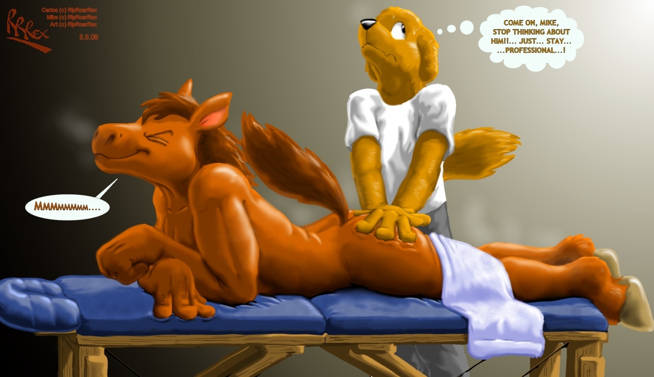
Carlos looks godlike. Anatomy and pose are awesome — the little compression-lines (or whatever they're called, creases) on his back, the muscles, the pecs and clavs, the neck, the mane... and the hands, man, great works on the hands, especially Carlos' left one, good stuff. I'd originally thought that the depiction of Mike's hands was off, until I looked at the bigger version — nope, no errors there. And great facial expressions to top all that off. Wow.

I'm not sure how well planned you are when you're doing pieces like this, Rip, but the overall composition came out great too, i.e. the picture's focus, lights and darks, hues, etc. The background gradient I really like. It creates nice balance given the contrast of both tones and expressions on either character's face — with Mike looking as pitiful as ever by the lamp, and his client simply enjoying himself over where it's dimmer.

I didn't even notice the bed until just a bit ago (that's a good sign, though, I think); I knew it was there and what it was, but on second glance the textures and wrinkles in it are well done, which means it's nothing to distract the viewer from what's going on. Again, I'm not sure if you consider these things individually or not, but still, props.

As a pawslut, I might bitch about the hooves looking a little goey/translucent over on the right, but the lighter shades and smoother lines / blurring places the focus in the pic better, so I can't legitimately bitch.

The only things that draw my eye are Carlos' tail — it looks off-center like it could be a little farther from the viewer — and his bicept — I'd think the line should snake forward (to the viewer's left) a little to round it better.

'Hope you don't mind full crits, it's really my own ascetic form of praise, you know.
_________________
Write your next story in 2nd-person.

Top
  Profile
 
 Post subject: Re: Carlos & Mike - "Just Stay Professional"
PostPosted: Sun Jun 08, 2008 5:38 pm 
Offline
Posts: 552
Species: Black Ice-Demon Dragon
Dammit, I was gonna say some of the things that Patch had said.

Anyways, the loss of the outline actually fits the theme of this picture and it is better for the overall. Although it is a different approach than your previous works, I believe that this style had a change.

And about the outlines, they've really changed what was supposed to be a drawing into more of a painting, or some sort of realism in that case. Without the big chunky outlines, the art points my eyes from corner to corner telling me how much density and how smooth every bit contributes to what the overall shows. Also being outlineless, I can actually feel the impressionism pulling out because the texture is smooth and soft, bringing more details with that.

So, another excellent piece, you sagacious raptor! :P

Top
  Profile
 
Display posts from previous:  Sort by  
Post new topic Reply to topic  [ 15 posts ] 


All times are UTC - 9 hours [ DST ]


Who is online

Users browsing this forum: No registered users and 3 guests


You cannot post new topics in this forum
You cannot reply to topics in this forum
You cannot edit your posts in this forum
You cannot delete your posts in this forum
You cannot post attachments in this forum

Search for:
Jump to:  
cron


LD5's forum is powered by nanosaurs running free and wee phpBB © 2008 phpBB Group
Copied Right 2473 Lava Dome Five Industries. This system contains adult material and is for big saurs only.